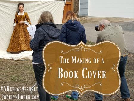
Today I'm so excited to take you behind the scenes, into the making of a book cover! There's more than one way to go about the process, of course. I will just share with you the most recent one in my experience: A Refuge Assured, published by Bethany House.
Even before we landed on a title, they asked for my input on the art direction. This is a great opportunity, and I was happy to put together an 8-page document for them. It included notes and images on period dress, location, book covers I like, and any other ideas or strong feelings I had about the cover. (For instance, I may have told them I'd like to stay away from the color pink, just as I normally say during title discussions to avoid the words "heart," "love," or "bride" because I don't want to give the impression that I write romance. I write straight historicals, which may have a romantic element, but it's not the entire plot.)
Oh! BTW, do you see any familiar images below? That gorgeous blue sleeve and lace detail graced the cover of The Lacemaker by Laura Frantz! Laura and I have many of the same 18th-century fashion pins on Pinterest. She's a master pinner!

Once I've sent in my input document, my job is done! The designer takes over, and I know the cover-to-be is in excellent hands. Today I've asked my cover designer, Jenny Parker, to answer some questions for us.
What would you say are the most important elements of a book cover—or are they all equally important?
Jenny: When the author of a book is well known, that name is probably the most important element on a book cover. Otherwise, I believe that—at least for fiction books—the art and title should work together to be the most impactful elements. This means the art must represent the story and it’s genre and draw in the reader. It also should indicate a place or time or even evoke a mood or an emotion.
The AIGA (The American Institute of Graphic Arts) said in their opening statement of the 2013 Book Cover Design Competition Results that a strong cover “somehow summarizes in a split second a work that may have taken its author months or even years to create.”
It’s also really important these days when people are buying books online for the title and author’s name to be readable even at a small size.
What aspect of designing a book cover is the most enjoyable for you? Which is the most stressful?
Jenny: It’s always fun to get my assignment and learn about the storyline and read all the research and little-known historical facts our authors have gathered. It gets me excited to do my own research focusing on clothing, architecture, or settings and then start brainstorming different ideas. I enjoy trying to recreate a believable scene from history.
The most stressful part is hearing all the differing opinions about what the right image is for the book and trying to come up with a cover that will satisfy everyone including editors, marketing, and sales. I’m so relieved after all that when the author is happy and when I personally feel the cover is strong.

What part of your job as a book cover designer would surprise readers?
Jenny: I don’t think it would surprise readers that my job is extremely fun: from learning about the great storylines to researching historical settings, costumes and other details to choosing models and costumes to creating the final product and seeing it in print.
What might surprise readers is the amount of work that goes into creating each cover, especially when a photo shoot is needed. They are so much fun but they require a lot of prep work in order to ensure that we capture just the right image (with the right emotion, lighting, angle, etc.) in the few short hours we have the model, photographer, and hair and makeup artist.
We take literally hundreds of photos of the models (usually around 700) that we have to go through to find the one perfect image for the front cover.

How do you decide whether to show the model’s entire face, part of her face (as in ARA) or none of her face (as in The Mark of the King)?
Jenny: The decision of how much face to show can be already decided by the editors and marketing staff before I even get the assignment. The general consensus here at Bethany House is that not showing a face conveys a literary tone and showing one gives it a Christian fiction tone.
When this hasn’t been decided, I try to show concepts for both options and let the group choose.
Once you have several options to choose from, who weighs in on them before you choose the final cover?
Jenny: We have a Creative Team headed by Creative Director Paul Higdon and comprised of seven or eight others including editors and marketing staff that meet together to discuss the options. Once they come to an agreement, the chosen cover is shown to our Executive Vice President of Sales and Marketing Dave Lewis and the author.

Thank you Jenny and company! I fully agree with your final decision on the winning cover for A Refuge Assured! (Novel releases Feb. 6: Available for pre-order now!)

Readers, did anything surprise you from this process?


Comments
So many details go into
Thanks for posting...love the
I love the picture that was
The cover chosen is beautiful
I actually like all of the
I guess I have never really
I am surprised at how many
Interesting post, Jocelyn!
Fascinating article! I had no
I am a firm believer that "a
Love these cover posts!! This
Thanks everyone, for being
Oh! This was really
I love how covers are
Thanks for sharing. I didn't
Wow! It would be so hard for
Fascinating! I didn't realize
Add new comment